Thursday, July 8, 2010

Standardized Chloropleth Maps


Standardized Chloropleth maps are very general in their data as well as their appearance and data. In this case this map represents the population of Canada under the age of 14. There is no official cesus data used in the evaluation of this map.

Isopleths


http://www.unc.edu/~meagsmch/ozone/o3isopleth.htm

An isopleth is used in geography and meteorology and in this case the graph shows the chemical reactions in the atmosphere that create ozone. the colors coinside with the chart in amount of reactionary chemicals.

Isopach


Isopach graphs in this representation above show seismic activity fro a distance of a crater. These types of graphs show seismic activity genertated over a small area.

isohytes


Isohytes show lines in which equal amounts of rainfall are found on areas of the Earth. This is a representation of annual rainfall amounts over this area of land.

Star Plots


http://start.jpl.nasa.gov/caseStudies/autoTool.cfm

In this star plot the center of the graph represents the most desirable results of the data. It shows the benefits and downfalls of how the variables interact.

Correlation Matrix


A correlation matrix shows correllations between all pairs of of data sets. Correllation matrix's are used to show statistics and relationships between two types of of variables.

Similarity matrix


This graph shows the genetic similarities in cannabis. It is graphed to show complex codes in relatively simple form.

Stem and Leaf Plots


http://www.eduplace.com/math/mhm/5/06a/index.html

Stem and Leaf plots are used to project mathamatical data in a relatively simple form. the plot above represents age groups of people sitting at a table. The stem is the 10's ie (3=30) and the leaves is the ones.

Box Plot


Box plots are used to represent statistical data on a horizontal scale. The graph above represents the annual snow depth at Mathsville ski Resort.

Histogram


Histograms aree used to show data of historical information. This is an example of fishing numbers over a period of 10 years.

Parallel coordinate graph


http://vis.lbl.gov/Events/SC07/Drosophila/


Parallel Coordinate Graphs are used in genetic mapping of relationships between genes of various types. This graph above shows the relationship between several diffrent genetic codes.

Triangular Plot


This type of chart represents the seismic activity from 3 diffrent points. This method is useful in determining volatile areas that may be prone to seismic activity.

Windrose


These types of graphs are often used to determine wind direction and wind speeds for a certain area of Earth. In the map above it shows the wind speeds and the direction of the wind over the state of Maine.

Climograph


Climographs are used in the study of weather patterns or other weather data investigations. In the graph above the dat shows the amount of precipitation over a 12 month time period, and the temperatures inviolved in those months.

Population Plot


These types of population plot graphs show diffrent levels of population covering large areas of information. In the graph above, it shows the population growth from 1950-2050 in the world, developed, and underdeveloped countries.

Scatterplot


These types of graphs show linear relationships between data of 2 variables. Depending on which direction the line goes (left to right) and (up and down) shows if the relationship is positive or negative. In the case above, the graph represents a positive relationship of data.

Index Value Plot


http://www.techmind.org/blog/index.html


This graph was used to evaluate stocks and the idea that they are relatively consistant at certain times of the month. This graph was used to show that the variations are relatively consistant due to industry pensions being invested on the same day every month.

Lorenz Curve


A Lorenz curve is used shows the degree of inequality that exists in the distributions of two variables. It is often used to show inequalities in income or wealth distributed inequally in society.

Bilateral Graphs


Bilateral maps are used to show graphical data that represents data from 0 to whatever. This type of data is useful for all types of information, ecspecially in statistical data.

Unclassed Chloropleth Maps


Unclassed Chloropleth maps cover a greater area than classed chloropleth maps. The data is more generalized to larger less specific areas. Furthermore, the color variations are less drastic than those used in other chloropleth maps.

Classed Chloropleth Maps


http://personal.uncc.edu/lagaro/cwg/color/Choropleth-5Good.gif

Chloropleth maps represent various forms of data. A classed chloropleth maps use smaller areas to provide data for. It uses colors to show variations in data like other chloropleth maps.

Range Graded Proportional Circle Map


indiemaps.com/.../histoLegend.png

Range Graded Proportional Circle Maps are used to show statistical data in which one symbol represents several diffrent areas of data. Although it is called a circle graph, circles are not always used to represent data.

Contineously Variable Proportional Circle Map


http://www.google.com


Proportional Circle maps display data in relation to the relative size of the cirlcles. In this case, the circles represent internet usage in Europe.

DOQQ


A DOQQ is used like a aerial photo however, there are no distortions or variations in the data due to camera angles. The DOQ can be used to review or revise other digital information. This type of map is valuable in DLG and topographic maps.

DEM


A DEM or Digital Elevation Map is a 3-D representation of elevations of an area of the earth's surface. Although this method is very appealling to the viewer of the map, often times the exact elevation data is misrepresented like the picture above.

DLG


A DLG is a digital line graph that represents in this case elevation throughout the United States. Each square represents a 40x60 mile area, and the greens, yellows, and reds represent higher elevations.

DRG


www.tceq.state.tx.us/gis/drg.html

DRG is an acronym for Digital Raster Graphics, which is a scanned image of a USGS topographic map. These types of maps are useful in the process of map layering because they are representative of the earth's surface. Furthermore, DRG contain all the standard map collar information.

Isotachs


www.crh.noaa.gov/lmk/soo/research/paps_11794.php

Isotachs are used in weather forecasting that shows wind direction and variations. It also depicts things like snowfall and rainfall amounts for a certain area.

Isobars


Here is an example of an isobar, it shows the variations between pressure in 4mb incraments. These are used in weather reports to help predict wind variations and also rain chances.

LIDAR


This image is from the LIDAR saatellite that monitors volcanoes like this one of Mt. St. Helens. This image is of the deformed crater floor inside the volcano.

Doppler Radar


http://www.weatherusa.net/blog/index.php?month=August_2004

This is a doppler radar image of Hurricane Frances that hit florida in August of 2004. The diffrent colors represent rain bands. The blue color is the lightest rainfall, followed by green, then yellow, then orange, and finally red.

Black and White Aerial Photo


http://www.horschgallery.com/addtocart2.aspx?pdctid=%C5%93O%18

Above is a Black and White Aerial photo of one of the coolest baseball stadiums ever made. This picture is of Wrigley Field, located in Chicago Illinois.

Infared Aerial Photos


pubs.acs.org/cen/government/86/8646gov2.html

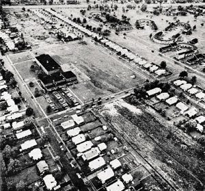
Above is an infared aerial photo of a city built in 1978 called the love canal. It was a city built by a buissnessman near the Niagra falls area for his emplyees of his industry. The white areashown on the ground was a contaminated spot due to chemical spillage, and beside it was the 99th street school house.

Cartographic animations


http://www.spc.noaa.gov


Here is a cartograpic animation of Hurricane Katrina from a satellite photo. As you can see the image is extremely detailed... look how well the eye is defined.. pretty neat!!

Statistical Maps


http://www.progetto-exp.org/?p=43


This map is a map showing the population density of the United States. It is representing where the most dense populations of people are found, and using the peaks as statistical refrence points.

Cartogram


Cartograms like the one shown above are usually used to portray population variations. The map above represents amphibian diversity by country, with darker colors representing more densely populated areas.

Flow Maps


http://www.mundi.net/maps/maps_014/


This is an example of a flow map. Just like its' name conveys, it shows the amount of flow or movement from one are to another. In this case, the map shows the telephone traffic from one country to the other.

Isoline Maps


This is an Isoline map that represents the depth of the water table in diffrent regions of China. This map is important because it is helping to alleviate the lack of water in the Northern part of China, by showing where the abundance of water is in the southern part can be drawn from.

Proportional Circle Maps


http://gsc.nrcan.gc.ca/mindep/synth_dep/sedex/images/fig1.jpg

This map is representative of a proportional circle map. This particular map is charting the mineral deposits in Canada.

Chloropleth Maps


http://my.ilstu.edu/~jrcarter/Geo204/Choro/Tom/

Chloropleth maps are thematic maps, this map in particular shows the amount of Hispanic or Latino in the state of Florida. The bolder the colors the more dense the population of Hispanic or Latino. From the map you can see the most dense populations are in the southern half of the state.

Dot Distribution Maps


http://operationmilitarykids.ohio4h.org/resources/bycounty.html

This map is a representation of the families of our active military soldiers in the state of Ohio. I thought this map was neat because it shows how spread out throughout the state people are wiling to fight for our country. In fact every county in the state of Ohio, is represented by at least one military family.

Propoganda Maps


http://strangemaps.wordpress.com/2006/11/23/38-the-world-according-to-ronald-reagan/

This an example of a propaganda map which is suppose to show the ideology and feelings Regan had towards the world. As you can see the artist that illustrated this map felt that Regan had an agenda, and specific ideologies about the world and their contribution to the United States.

Hypsometric Map


http://www.earthexplorer.com/2009-03/Subsurface_Geology_Challenges_Goiania_Metro.asp

This is an example of a hypsomertric map used in deciding if a subway running under the city of Goiania, Brazil was possible. this is a picture of the subsurface of the ground in which the subway was to be excavated in. This image helped in the decision to not allow a subway to be constructed under the city due to soil and water issues.

PLSS Maps


www.fgdc.gov/.../2008/web-version/AppendixC.html

PLSS maps stand for Public Land Survey System Maps. They can encompass many types of data used in georeferencing, as well as land ownership and transfer. This map represents the states in which PLSS is being used, or at least being planned to be used.

Cadastral Maps


This is an example of a Cadastral Map showing the precise land parcels and adjoining areas or facilities. As you can see there is a lot of detail in this map, which is useful in the understanding of property lines. This type of Information is usually done by aireal or satelitte imagery devices.

Thematic Map


This is an example of a thematic map. It represents the concentration of people that are Hispanic/Latino in Mecklenburg County, N.C.. These results are from the 2000 Census, and are represented by varying color changes

Topographic Maphttp://geology.com/state-map/florida.shtml


This is a topograpic map representing the elevations of Florida. As you can see there are little variations of elevation throughout the state. However, the elevations that are represented are done so by diffrent color variations.

Planimetric Maps


This is a planimetric map of Fort Vancouver, in Vancouver B.C. It shows the horizontal representation of Fort Vancouver National Park.

Mental Map

http://www.geovista.psu.edu/grants/MapStatsKids/New_MSK/concepts_mentalmaps.html
This is an example of a mental map. It is a representation of an image from a persons mental recollection of an area. It is usually not very accurate to scale, but is effective in a simplistic example of a map.